What using % in an HTML width specification does

If at any point you don't believe me, view the page source.

This image is sized at width = 80%. Because it isn't contained in anything but the page it gets stretched to 80% of the page width:


The natural width of this is 500 pixels, so this may look a little odd.

Here's an image that's naturally 165 pixels wide x 257 high, so you can see that it gets stretched to about the same width (and looks even more awful). I also restricted the height to 100 pixels so it doesn't dominate everything. In HTML you can specify image width and height as percentage of the space available or an absolute number of pixels. Here I've done one of each. This is 80% width, and you can see it's not 80% of 157 pixels.


Now we make a table that's 50% of the page width and put the image inside that, also restricted to 80% width:
(I'm turning on borders on these tables so you can see the structure. Scoop uses tables but with borders turned off. Each comment is in it's own table, and the tables are indented by being in a list.)

That uses exactly the same image tag (and image) as the top one
Now if we define another table at 50% width, it becomes 50% of the width of the outer one, or 25% of the page width:
And now we stick in the same image tag again, at 80%. Now this 80% becomes 80% of 50% of 50%

Resize your browser window by dragging the lower right corner of it, and notice that the table and image widths above change to fit the available space (but the font stays the same size).

This image, at it's natural size, has the real width and height specified in the tag, per the HTML standard. It doesn't resize when you change the window size. It also has an alt tag specified, which makes it the only one on this page that's acceptable to an HTML validator.
Sample image

This image doesn't have any width and height specified (an HTML validator will kick up a fuss over this), it just appears at its natural size:

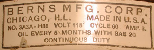
These are all links to the same image, http://www.otherpower.com/images/scimages/6871/berns_label.jpg

This is how Scoop indents things. It uses one of several HTML "list" structures and hangs the table that houses each comment off one of the items in the list. If a comment gets a comment made to it, that starts a new list, and if that comment gets a comment that starts another list, so it all gets indented more and more. With each comment going in a table and the tables hanging off an ever-indenting list, the table boxes get smaller and smaller. This makes a big difference in how an 80% width image appears.

HTML has several list types:

There's an unordered list, with bullets:
An ordered list, with numbers:
  1. Item 1
  2. Item 2
    1. Item 2a
  3. Item 3

But Scoop uses the Definition List, which doesn't have bullets or numbers. I've also added a column on the right to simulate the one Scoop has.
Item 1
Item 2
You can add almost anything to one of these lists (here's a table)
Here's a sample post

(image at 80% again)
An indented section is made by starting a new list in the middle of the first one
Here's a comment to the sample post above
Here's a comment to the comment above
Just copying and pasting to show how things get indented
Here's a comment to the comment above

(image at 80%)
Here's a comment to the comment above

image still at 80%
And this is how we run out of space and off to the right side of the screen...
 
Simulated

right

side

menu

area

When images get shrunk this way, you can always view them at their normal size by right-clicking on them and choosing "View Image".

A good concise guide to HTML that I've used for years is Kevin Werbach's Bare Bones Guide to HTML (no style sheet stuff though)